July 18, 2026•17 min read
How to Design a Logo for a Fashion Brand (Beginner Guide 2026)
Your logo shows up on woven neck labels, hang tags, embroidery, and Instagram. This beginner guide covers logo types, fonts, colors, and the mistakes that quietly hurt small fashion brands.
Picture of How to Design a Logo for a Fashion Brand (Beginner Guide 2026) article
Your logo is the one graphic that has to survive being shrunk to 8mm on a woven neck label, embroidered on a left chest, screen printed on a tote, and squeezed into a 32-pixel favicon. Most beginner advice on how to design a fashion logo skips that part. It teaches you to pick a nice font and a color you like, then hands you a PNG and calls it done. For an apparel brand, that is where the trouble starts.
Learning how to design a fashion logo is really about learning where the logo has to work, not just how it looks on your laptop. This guide walks you through the whole thing for a small clothing brand: the logo types worth considering, how to choose type and color for garments, the physical places your mark has to hold up, and whether to do it yourself or hire someone. It also covers the mistakes that quietly cost new brands money, and how your logo connects to the bigger job of keeping your product photos consistent.
How to design a fashion logo that works on garments
A good clothing logo is simple, recognizable at a glance, and legible when it is tiny. That much is true for any logo. Apparel just raises the stakes on the last part.
Think about where a software company shows its logo: a website header, an app icon, a pitch deck. All screens, all backlit, all reasonably large. A fashion brand shows its logo on fabric, at small sizes, often in a single color, sometimes stitched thread by thread. Those constraints kill a lot of pretty logos that look fine on a screen.
Three things matter more for apparel than for most other categories:
- Small-size legibility. A woven label or a left-chest embroidery is often 2 to 4 cm wide. Thin lines and fussy detail vanish at that size.
- Single-color and reversed versions. You will need your logo in solid black, solid white, and knocked out on a dark garment. If it only reads in full color, it is not finished.
- Reproduction across materials. Screen print, embroidery, heat transfer, foil, and debossing each have limits. Embroidery in particular cannot hold hairline gaps or gradients.
Get those right and you have a mark that behaves the same on a care label, a paper hang tag, and a phone screen. That consistency is worth real money. Companies that present their brand consistently across every channel see revenue lifts of up to 33%, according to the Lucidpress State of Brand Consistency report.
Define your brand identity before you design
The fastest way to waste a weekend is to open a design tool before you know what the brand stands for. The logo is an expression of the brand, so the brand has to exist first, at least on paper.
Answer these before you draw anything:
- Who is this for? A streetwear label for 19-year-olds and a slow-fashion linen brand for 40-year-olds do not share a font.
- What three words describe the vibe? Pick words you can actually design toward, like "raw," "quiet," or "playful." Skip empty words like "premium."
- Where will people see the brand most? Instagram grid, market stall, wholesale line sheet, and Shopify each pull the design in a slightly different direction.
- What already exists in your niche? List five brands you admire and five competitors. Note what they all do so you can avoid blending in.
Put the answers on a single moodboard with type samples, colors, and reference logos. This is the brief you will judge every draft against. Without it, "I like it" is the only test you have, and that test is useless.
Fashion logo types: wordmark, monogram, pictorial, and combination
Most beginners jump straight to inventing an icon. For a young apparel brand, that is usually the wrong instinct. An abstract symbol means nothing until you spend years teaching people what it stands for, and you probably do not have that budget yet. Your brand name, set well, does more work on day one.
Here are the four types worth knowing.
| Logo type | What it is | Best for | Watch out for |
|---|---|---|---|
| Wordmark | The full brand name in custom or curated type (think most luxury houses) | New brands that want the name remembered fast | Long names get small on labels |
| Monogram / lettermark | Initials or a single letter mark | Brands with long names or a strong single initial | Can read as generic if the letters are plain |
| Pictorial / symbol | A recognizable icon (an actual object) | Brands with a clear visual concept and time to build recognition | Weak on its own for unknown brands |
| Combination | Wordmark plus a symbol or monogram, usable together or apart | Almost every small fashion brand | Needs a plan for which piece goes where |
For most small clothing brands, a combination mark is the practical answer. You build a clean wordmark for your website, packaging, and hang tags, plus a compact monogram for the neck label, embroidery, favicon, and social avatar. One system, two lockups, every surface covered.
Wordmark vs monogram: a quick decision
If you are stuck between the two, use this:
- Choose a wordmark when your name is short (one or two words), easy to read, and you want people to learn the name itself.
- Choose a monogram when your name is long, hard to spell, or you need a compact mark for tiny placements.
- When in doubt, build both as one combination system so you never have to choose in the moment.
Choosing typography for a clothing brand logo
Type is where most fashion logos are won or lost, because so many of them are wordmarks. The font carries the personality, so treat the choice as a design decision, not an afterthought.
A few starting points that hold up on apparel:
- Sans-serif (Helvetica, Futura, Neue Haas, Aktiv Grotesk) reads as modern, clean, and streetwear-friendly. It stays legible when small, which helps on labels.
- Serif (Didot, Bodoni, Garamond) reads as classic, editorial, and higher-end. High-contrast serifs like Didot look elegant large but can lose their thin strokes when tiny or embroidered.
- Custom or modified type is what separates a brand from a template. Even small tweaks, like tightening the spacing or altering one letter, make a stock font feel owned.
Skip decorative scripts and thin display fonts as your primary logo, however nice they look on screen. They are the number one cause of logos that turn into an unreadable smudge at label size or in stitching.
A practical test: set your logo, print it at 2 cm wide, and look at it from arm's length. If any letter closes up or blurs, the font is too delicate for garments.
Choosing colors that work on apparel, labels, and screens
Color on clothing behaves differently than color on a screen. A shade that glows on your monitor can look muddy on a natural cotton label or wrong on a dyed garment. Design your logo to survive that.
The core rule for apparel: your logo has to work in one color first. Design it in solid black on white, confirm it reads, then confirm the reverse (white on black). Only after that should you add a color palette. If the mark only works in full color, it will fail the moment it hits a woven label or a single-screen print.
Rough color associations buyers actually read in fashion:
- Black and white signals minimal, premium, and versatile. It is the safe, timeless default and the cheapest to print.
- Earthy tones (clay, olive, oat) signal natural, sustainable, and slow fashion.
- Bright, saturated color signals youthful, playful, streetwear energy.
- Metallics (foil gold or silver) signal luxury, but they add real cost on packaging and tags.
Keep the logo itself to one or two colors. More than that multiplies your printing costs on every label, tag, and garment, and it rarely improves recognition. You can always be more colorful in your photography and packaging, where extra color is free.
Where your logo has to work: labels, tags, packaging, and social
This is the section most tool-owned guides skip, and it is the one that will save you a reprint. Before you sign off on a logo, walk it through every place a clothing brand actually uses it. If it fails on any of them, fix it now, not after you have ordered 500 woven labels.
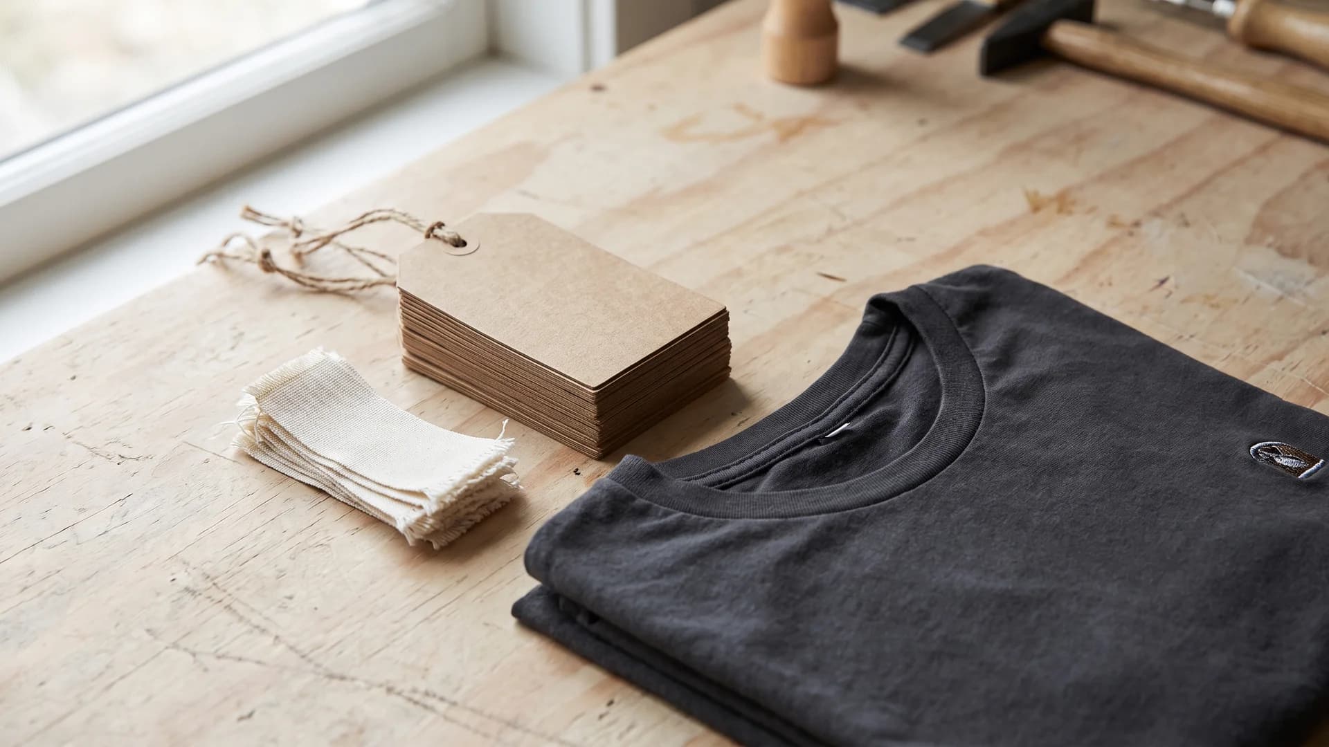
Blank hang tags and woven neck labels for a clothing brand logo laid out on a workbench
| Placement | Typical size | Constraint | What it demands of your logo |
|---|---|---|---|
| Woven neck label | 2 to 5 cm | Woven thread, low detail | Simple mark, no hairlines, single or two colors |
| Hang tag | 4 to 8 cm | Print on card, both sides | Full wordmark on front, monogram or info on back |
| Left-chest embroidery | 6 to 9 cm | Stitch minimums, no gradients | Bold shapes, no gaps under ~1mm |
| Screen print (front) | 20 to 30 cm | Limited by number of screens | Fewer colors keeps it cheap |
| Packaging / mailer | Varies | Often single-color stamp or foil | Clean one-color version |
| Favicon / social avatar | 32 to 400 px | Tiny circle or square | The monogram, not the full wordmark |
Two takeaways fall out of this table. First, you need a compact version (usually your monogram) for the smallest slots, because a long wordmark is unreadable at neck-label size. Second, you need a clean one-color version for embroidery, foil, and stamps, because those methods cannot reproduce gradients or fine detail.
The file format matters just as much here. For apparel, vector files (.ai or .svg) are non-negotiable, because they scale to any size without losing quality and printers ask for them by default. Always get the original vector from whoever makes your logo, not just a PNG or JPEG, as the Zoviz clothing logo guide points out. A PNG-only delivery will get bounced by your embroiderer and your foil printer.
How to design a fashion logo: DIY tools vs hiring a designer
You have three realistic paths: a DIY design tool, an AI or template logo maker, or a professional designer. Each fits a different budget and stage. DIY is fine for a first drop, as long as you get a vector file out the other side.
| Path | Typical cost | Best for | Trade-off |
|---|---|---|---|
| DIY design tool (Canva, Figma) | Free to ~$15/mo | Founders with some taste and time | You are the designer, so quality tracks your skill |
| AI / template logo maker (Looka, Zoviz, Tailor Brands) | ~$20 to $100 | Fast first logo on a tight budget | Templates can look generic; check vector export |
| Freelance designer | ~$250 to $1,000+ | Brands ready to invest in a real identity | Costs more, takes longer, needs a clear brief |
| Design agency | ~$2,500+ | Funded brands wanting a full identity system | Overkill for a first drop |
On price, most small businesses spend between $250 and $1,000 for a professional logo, with a range from roughly $100 for a beginner freelancer to $2,500 and up with an agency, according to Fiverr's logo cost guide.
A sensible middle path for a first collection: rough out the concept yourself in Figma or a maker to lock the direction, then pay a freelancer to refine the type, build the monogram, and hand over clean vector files. You spend a fraction of a full agency fee and still avoid the PNG-only trap.
Whichever path you pick, insist on three things at delivery: the editable vector source, a one-color version, and the logo in black, white, and reversed. If you cannot get those, the job is not finished.
7 beginner fashion logo mistakes to avoid
Most bad clothing logos fail for the same handful of reasons. Check your draft against this list before you commit.
- Over-complication. Too many elements, fine detail, or a busy icon. It dies at label size. Simpler almost always wins.
- Decorative script as the primary mark. Thin, curly fonts smudge in print and blur in embroidery. Keep scripts for accents, not the logo.
- Leading with a meaningless icon. An abstract symbol carries no meaning for a brand nobody knows yet. Let your name do the work first.
- Designing only in color. If your logo needs its gradient to read, it fails on a single-color label. Design black-first.
- Ignoring small sizes. A logo that only looks good large is half a logo. Test it at 2 cm.
- Accepting PNG-only files. Without a vector, you cannot scale, print, or embroider cleanly. Always get .ai or .svg.
- No compact version. One long wordmark cannot cover a neck label and a favicon. Build a monogram lockup too.
None of these are about talent. They are about knowing the constraints before you fall in love with a draft.
From logo to a full brand: keeping product imagery consistent
A logo is the start of a brand identity, not the whole thing. Once your mark, fonts, and colors are set, the next place shoppers judge your consistency is your product photos. This is where a lot of small brands lose the thread. The logo looks sharp, but the product shots are a jumble of different models and backgrounds, so the storefront feels stitched together from three different brands.
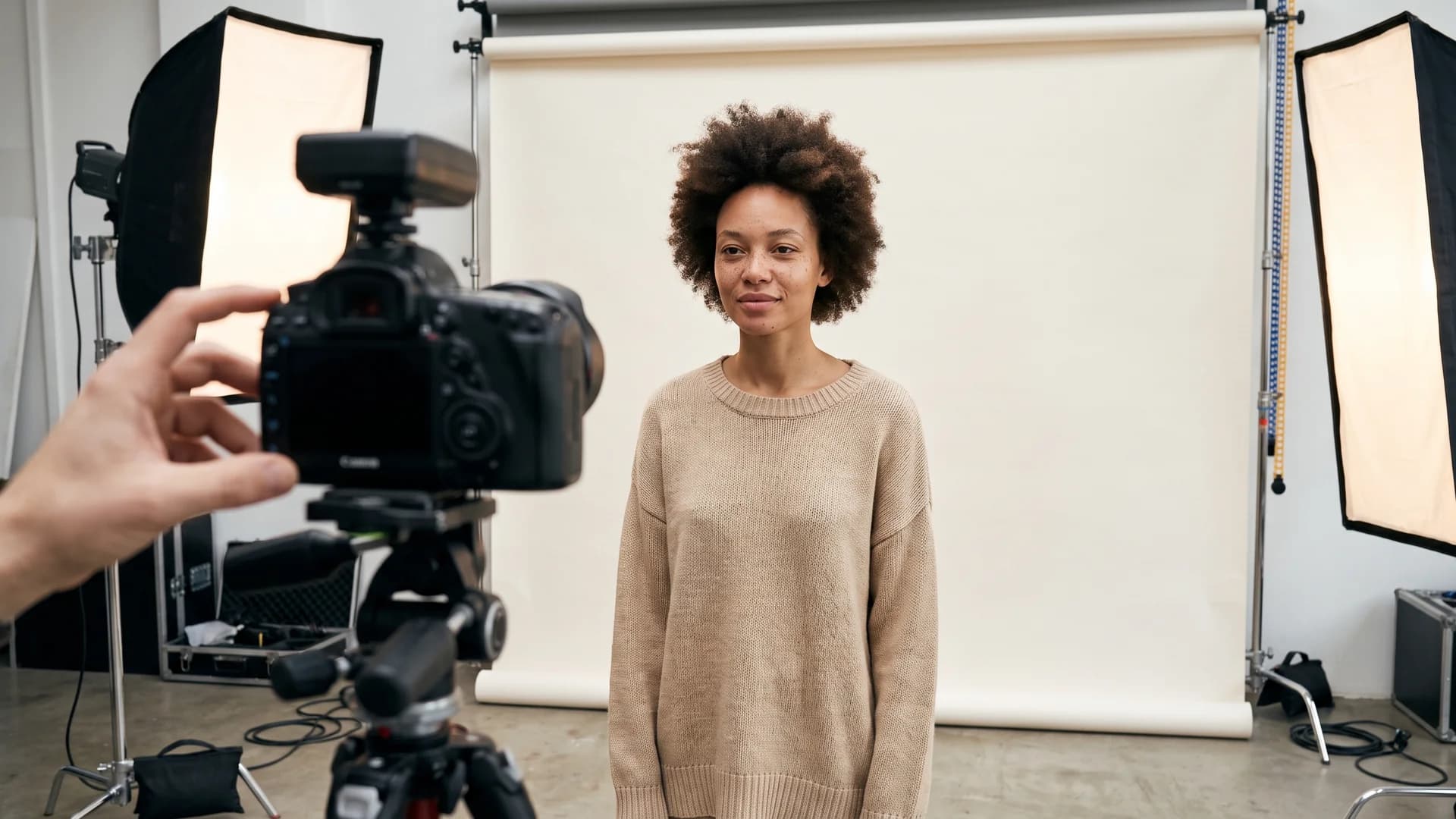
Fashion logo design carried into a consistent studio product photo shoot of a model in a neutral sweater
Visual consistency does more than keep the storefront tidy. Professional, on-brand product photos correspond to roughly 33% higher conversion than poor-quality photos, per research cited by BlendNow. The same discipline that makes your logo work everywhere should carry into every on-model photo in your catalog: the same model, the same styling logic, the same backgrounds and framing across a collection.
Keeping that consistent used to mean rebooking the same model, photographer, and studio for every drop, which is exactly the kind of budget a small brand does not have. This is the gap AI fills. With tools that keep consistent AI models across a whole line, you can shoot a new collection on the same recognizable face and the same clean setup every time. If you are working from flat-lays, flatlay to model conversion turns a product shot into an on-model image in under 15 seconds, and an AI fashion model generator can spin up a brand-consistent cast from a prompt when you want variety without losing coherence.
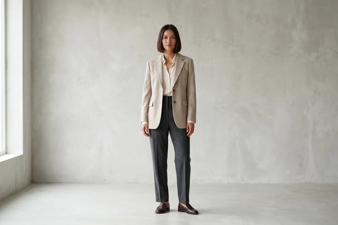
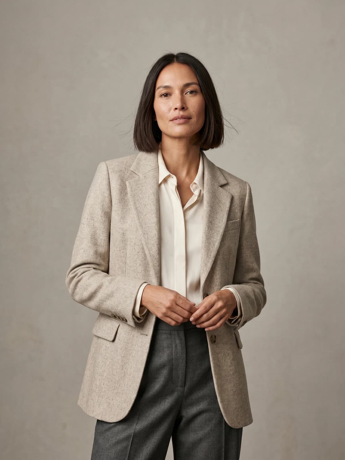
The same model across your whole catalog
Keep one signature model consistent across every product, pose, and collection so your storefront looks like one brand.
If you want to go deeper on the imagery side after your logo is set, our guide on how to keep product images consistent across your catalog covers the model, lighting, and framing rules in detail. And if you are weighing platforms, WearView bundles model creation, try-on, and product-to-model in one place, with plans from $29/month.
Key takeaways
- Design for the smallest surface first. If your logo reads on a 2 cm woven label, it reads everywhere. Test at that size before you commit.
- Pick a combination mark. A clean wordmark plus a compact monogram covers hang tags, embroidery, favicons, and social avatars from one system.
- Go black-first, one or two colors. Confirm the logo works in solid black and reversed white before adding any palette, so it survives single-color printing.
- Always get vector files. Insist on .ai or .svg plus one-color and reversed versions at delivery, whether you DIY or hire out. PNG-only is a dead end.
- Extend the discipline to your photos. Once the logo is set, keep your model, styling, and backgrounds consistent across the catalog, which is where AI on-model tools earn their place.
FAQ
What makes a good clothing brand logo? Simplicity, small-size legibility, and versatility. A good clothing logo reads at a glance, stays clear at 2 cm on a woven label, and works in a single color. If it needs full color or fine detail to make sense, it will fail somewhere in your product line.
Should a fashion brand use a wordmark or a monogram? Use a wordmark if your name is short and you want people to remember the name itself. Use a monogram if the name is long or you need a compact mark for tiny placements like neck labels and favicons. The safest answer for most small brands is a combination mark that gives you both from one system.
What are the best fonts for a clothing brand logo? Clean sans-serifs (Helvetica, Futura, Neue Haas) for modern and streetwear brands, and refined serifs (Didot, Bodoni, Garamond) for classic or higher-end labels. Avoid thin decorative scripts as your primary mark, since they blur in print and embroidery. Modifying a stock font slightly makes it feel owned rather than templated.
How many colors should a fashion logo have? One or two. A single-color logo is cheaper to print on labels, tags, and garments, and it forces a stronger design. Every extra color multiplies your printing cost across every placement, so keep the logo restrained and save the color for photography and packaging.
Can I design a fashion logo myself for free? Yes, using tools like Canva or Figma, especially for a first drop. The catch is output: make sure you can export a vector file (.svg), not just a PNG, or your embroiderer and printer will reject it. DIY works fine when you have some taste and time; hire a freelancer when you are ready to invest in a distinct identity.
How much does a clothing brand logo cost? Most small businesses spend between $250 and $1,000 for a professional logo. Beginner freelancers can go as low as around $100, while agencies run $2,500 and up. DIY makers sit in the $20 to $100 range but vary a lot in quality, so always check the vector export.
Why does my logo need to be a vector file? Vector files (.ai, .svg) are built from math, so they scale to any size without losing quality, from a favicon to a shopfront banner. Printers and embroiderers ask for vectors by default. A PNG or JPEG is fixed-resolution and gets blurry or blocky when resized, which makes it useless for production.
How do I make sure my logo works on clothing labels and tags? Build a compact version, usually your monogram, for the smallest slots, and a clean one-color version for embroidery, foil, and stamps. Print the logo at 2 to 4 cm and check that no letter or line closes up. Confirm it reads in solid black and knocked out in white before you order any labels.
Sources: Lucidpress State of Brand Consistency (via PR Newswire), Fiverr Logo Design Cost Guide, BlendNow (citing Shopify research), Zoviz Clothing Logo Maker Guide (2026)
WearView Team
WearView Content & Research Team
WearView Team is a group of fashion technology specialists focused on AI fashion models, virtual try-on, and AI product photography for e-commerce brands. We publish in-depth guides, case studies, and practical insights to help fashion businesses improve conversion rates and scale faster using AI.