To boost your conversion rate, you have to start thinking like a detective. It all begins with digging into the data—looking at metrics like bounce rate, add-to-cart rate, and cart abandonment—to find exactly where you're losing customers. This isn't just about numbers; it's about creating an actionable roadmap to fix the biggest leaks in your sales funnel.
Finding the Leaks in Your Conversion Funnel
Before you can fix a leaky bucket, you have to find the holes. It’s the same exact principle for your online store.
Throwing random tactics at your site without understanding why people are leaving is just a shot in the dark. A methodical diagnosis of your conversion funnel is the only way to make changes that actually move the needle. This means looking past vanity metrics like total traffic and digging into the behavioral data that tells the real story of what your customers are doing.
The goal is to get inside the user's head at each stage. Why did they land on a product page but not add anything to their cart? Why did they fill a cart only to leave seconds before paying? Answering these questions means it's time for a deep dive into your analytics.
Diagnosing the Three Primary Leak Points
Your customer's journey has three main places where things tend to go wrong. By isolating the data for each of these stages, you can find your weakest link and focus your energy where it will have the biggest impact.
- High Bounce Rate (The Quick Exit): This is the percentage of visitors who land on a page and leave without doing anything else. A high bounce rate on a product page could mean anything from a mismatch between your ad and the landing page to bad imagery or slow load times. It’s the digital version of a customer walking into your store, taking one look around, and immediately walking back out.
- Low Add-to-Cart Rate (The Window Shopper): This metric tells you that people are looking but not committing. They're browsing, clicking around, but something is stopping them from taking that next step. The friction could be unclear product descriptions, confusing sizing charts, or unconvincing photos that just don't build desire.
- High Cart Abandonment (The Final Hurdle): This one hurts the most. A customer has shown clear intent to buy, but something in the checkout process spooks them. The usual suspects? Unexpected shipping costs, a long and complicated form, or a lack of payment options they trust.
This flow chart shows exactly where those potential customers are getting lost.
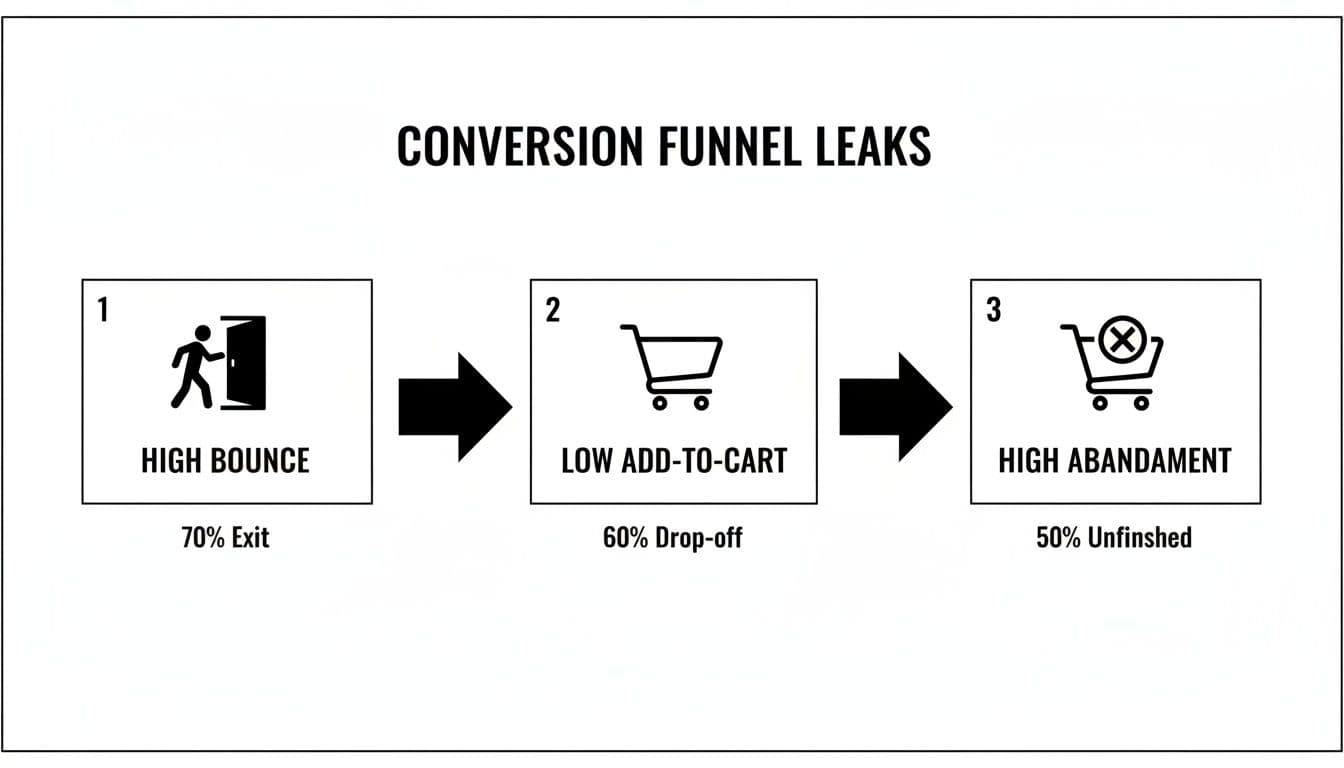
Conversion funnel leaks diagram showing high bounce, low add-to-cart, and high abandonment rates.
This simple visual really drives home how each leak feeds into the next, which is why it's so important to fix problems from the top of the funnel down.
Turning Analytics into Actionable Insights
Your number one tool for this investigation is going to be Google Analytics (GA4). It lets you build custom funnels that track users from one step to the next, clearly showing where your biggest drop-offs are happening. To really get the most out of it, understanding current trends and optimizing GA4 conversions with best practices is a massive help.
Let's put this in context. In the hyper-competitive fashion space, retail conversion rates hover around just 1.9% globally. Tiny improvements make a huge difference. Consider that poor visuals alone contribute to a mind-boggling 71.3% cart abandonment rate, which jumps even higher to 77.2% on mobile. That single data point tells you just how critical your product presentation is at every single stage.
To help you get started, here are the essential metrics you should be tracking at each stage of the funnel.
Key Ecommerce Funnel Metrics to Watch
| Funnel Stage | Key Metric | What It Tells You | Industry Benchmark (Fashion) |
|---|---|---|---|
| Awareness/Discovery | Bounce Rate | Are your landing pages engaging or are people leaving immediately? | 40-55% |
| Consideration | Add-to-Cart Rate | Are product pages convincing enough to make shoppers take the next step? | ~7-8% |
| Decision/Purchase | Cart Abandonment Rate | Is there friction in your checkout process that's killing sales? | ~71% |
| Overall | Conversion Rate | The ultimate measure of your site's effectiveness from visit to sale. | 1.9% |
Tracking these numbers gives you a clear, data-backed starting point. Instead of guessing what's wrong, you'll know exactly which part of the customer journey needs your attention first.
By translating raw data into a narrative about user behavior, you stop guessing and start making informed decisions. Your analytics platform isn't just a dashboard of numbers; it’s a treasure map pointing directly to your lost revenue.
Creating Product Pages That Actually Convert
Think of your product page as your digital fitting room. For any fashion brand, this is the make-or-break moment. It's where a casual browser decides to become a buyer or just clicks away, probably forever. They can't feel the fabric or see the drape in person, so your images and words have to do all the heavy lifting to bridge that gap.
Getting this right is both an art and a science. It’s about building a visual story that answers every little question a shopper has, often before they even know they have it. This means you have to go way beyond a single, static photo on a white background. You need to create a rich, multi-faceted experience that builds desire and, most importantly, trust.
The Anatomy of a High-Converting Visual Experience
Great product photography isn't just about showing an item; it's about conveying its quality, its texture, and how it will make the customer feel. That basic shot against a white wall? It's a starting point, but it's rarely enough to close the deal in today's crowded market.
To truly convince someone, you need a full suite of images that tell a complete story. This visual toolkit should be non-negotiable for every single product you list. For brands looking to really dial in their process, diving into detailed product photography guides can build a rock-solid foundation for visuals that genuinely sell.
Every fashion product page should have these essential shots, no exceptions:
- The Hero Shot: A clean, clear, on-model photo where the entire garment is the star.
- Detailed Close-Ups: Get right in there. High-res shots of the fabric, the stitching, the buttons, the zippers. These tiny details scream quality and justify your price.
- Lifestyle in Context: Show the product in the wild. On-model photos in a real-world setting help shoppers picture themselves wearing it in their own lives.
- Multiple Angles: Front, back, and side views are the absolute minimum. Show it from every angle you can think of to erase any doubt.
- Fit and Drape: Use images or, even better, video to show how the fabric moves and hangs on a real body. This is critical for communicating the true fit and feel.
The Power of On-Model and Diverse Imagery
It’s been proven time and time again: showing clothing on a human body seriously boosts conversion rates. On-model shots help people understand scale, fit, and styling in a way a sad hanger photo never could. But let's be honest—traditional photoshoots are a nightmare. They're expensive, slow, and a logistical headache.
This is where technology gives you a massive leg up. Innovative platforms now let brands generate an endless variety of on-brand model imagery without ever booking a studio. You just upload a flat photo of your garment and can instantly create photorealistic images with diverse models that actually look like your target customer. This doesn't just slash production costs by up to 90%; it gets your products online in a fraction of the time.
The ability to generate inclusive and varied model imagery on demand is a game-changer. It allows even small brands to compete with established players by creating a professional, relatable, and high-converting visual experience for every product.
Moving Beyond Static Images to Build Trust
High-quality photos are your foundation, but the brands that are really winning use a mix of media to create an immersive experience. Sometimes, a little bit of dynamic content is the final nudge a hesitant shopper needs to hit "Add to Cart."
Consider adding these powerful elements to your pages:
- Product Videos: A short clip of a model walking, turning, and moving in the garment gives an unparalleled sense of its real-life fit, flow, and appearance.
- 360-Degree Views: Giving customers total control with an interactive 360-degree viewer lets them examine the product from every angle, zoom in on details, and get rid of any lingering uncertainty.
- User-Generated Content (UGC): Featuring photos from real customers wearing your products is pure gold. It’s one of the most powerful forms of social proof, building authenticity and helping new shoppers see how an item looks on different body types.
Don't Let Page Speed Kill Your Conversion Rate
You can have the most stunning, high-resolution imagery in the world, but if your page takes forever to load, your customers will bounce before they ever see it. In ecommerce, every single second counts.
Believe it or not, just a one-second delay in page load time can cause a 7% reduction in conversions.
Image optimization isn't just a nice-to-have; it's essential. The goal is to find that sweet spot between visual quality and file size. Use modern image formats like WebP, which offers much better compression than old-school JPEGs, and always, always compress your images before you upload them. This simple step ensures your beautiful visuals load almost instantly, keeping impatient shoppers engaged and moving them smoothly toward checkout.
Designing a Frictionless Checkout Experience
You’ve done all the hard work. A customer loves your product, trusts your visuals, and has added it to their cart. This is it—the final, critical step. And it’s exactly where an astonishing number of sales fall apart.
The single biggest reason for cart abandonment? A clunky, confusing, or surprisingly expensive checkout.
Think of it like the last hundred meters of a marathon. After running for miles, the last thing you want is to suddenly find hurdles and confusing signs in your path. It's the same for a motivated buyer—they want a clear, fast, and secure path to the finish line. Every extra field, every unexpected cost, and every moment of doubt eats away at their motivation.
By systematically rooting out these friction points, you can dramatically improve your conversion rate and capture sales that are currently slipping through your fingers. It’s all about making the final step the easiest one.
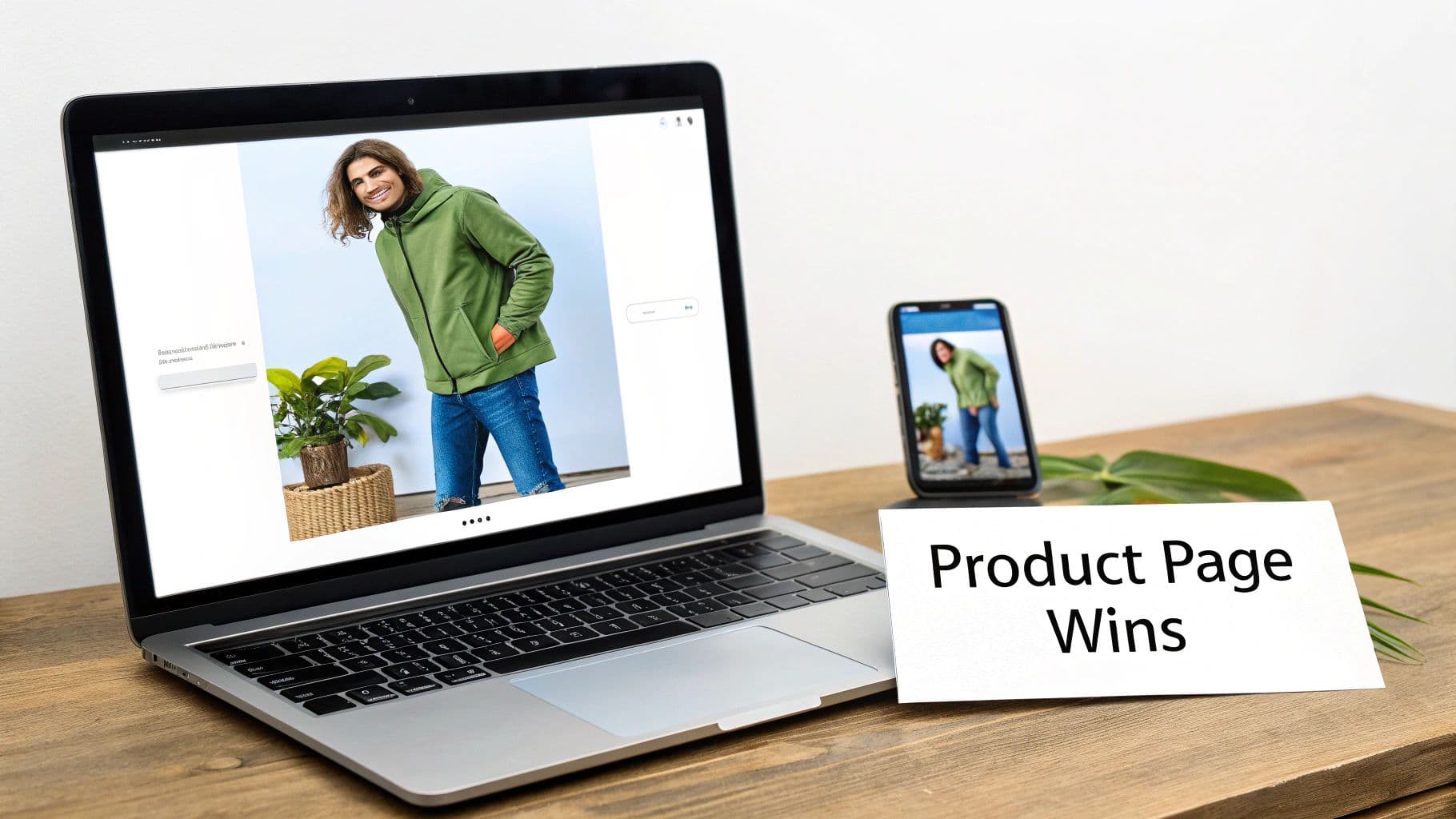
Laptop and smartphone display a product page featuring a man in a green hoodie, with a 'Product Page Wins' card.
Simplify the Path to Purchase
The golden rule of a high-converting checkout is simplicity. Your job is to get the customer from "checkout" to "thank you" with the least amount of thought and effort possible.
One of the most powerful moves you can make is offering a guest checkout option. Forcing a new customer to create an account before they can buy is a massive conversion killer. Give them the choice to buy now and create an account later if they want.
Next, you need to be ruthless with your form fields. Do you really need their phone number, date of birth, and a second address line? Every single non-essential field you remove makes the process faster and less intimidating.
- Only ask for what's absolutely necessary for shipping and payment.
- Use auto-fill options for addresses to speed things up.
- Clearly mark required fields so customers aren’t left guessing what’s mandatory.
Offer Modern Payment Flexibility
People expect convenience, especially when it comes to paying. The days of only accepting traditional credit cards are long gone. Integrating digital wallets isn't just a "nice-to-have" anymore—it's essential for a smooth checkout.
By incorporating one-click payment options like Apple Pay, Google Pay, and PayPal, you let customers skip the tedious manual entry of card details and shipping info. This doesn't just speed up the process; it adds a layer of trusted security they already recognize.
These payment methods can give your mobile conversions a huge boost, since typing in long strings of numbers on a phone is a real pain. The easier you make it for someone to give you their money, the more likely they are to do it. Modernizing your backend can make this a breeze; in fact, many of the best AI tools for ecommerce now focus on optimizing this entire journey, right down to the final payment.
Build Trust When It Matters Most
The checkout page is where customers are most vulnerable. They're handing over personal and financial information, and any element that feels unprofessional or insecure can kill the sale instantly. Building trust at this final stage is non-negotiable.
Your most powerful tool here is transparency. The number one reason for cart abandonment is unexpected costs. Be upfront about all fees—especially shipping—long before the final payment screen. Show these costs on the product page or in the cart to prevent sticker shock at the end.
Here are a few other essential trust-builders:
- Display Security Badges: Prominently feature logos from trusted security providers like Norton, McAfee, or your SSL certificate. These are quick visual cues that tell customers their data is safe.
- Make Your Return Policy Obvious: A clear, generous, and easy-to-find return policy removes the risk from their decision. Link to it directly from the checkout page.
- Provide Clear Contact Info: A visible phone number or live chat link shows there's a real company ready to help if something goes wrong.
When you design your checkout with the customer’s mindset at the forefront—prioritizing speed, simplicity, and security—you can turn more browsers into buyers and plug one of the biggest leaks in your conversion funnel.
Using Social Proof and Urgency to Drive Action
Modern shoppers are smart, but they're also skeptical. Before they click "buy," they're looking for a sign—some reassurance from other people that they're making a good choice. This is social proof, and it’s one of the most powerful levers you can pull to lift your conversion rate.
When someone sees that other people have already bought, used, and loved a product, it builds a layer of trust that no amount of slick marketing copy ever could. It validates their own interest and gives them the confidence to go for it. Your job is to weave these trust signals throughout your site so they feel like a natural part of the shopping journey.
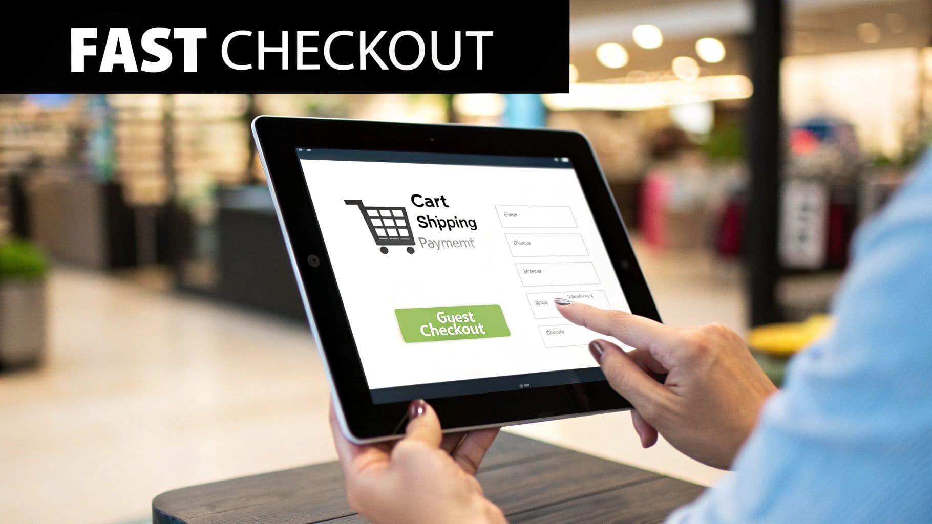
A person's hands tapping on a tablet screen showing an online fast checkout process with a shopping cart icon.
Building Confidence with Authentic Social Proof
Authenticity is everything here. Today’s customers can spot a fake testimonial from a mile away. You have to showcase genuine feedback and real user experiences to build a brand that people actually trust.
Here are the heaviest hitters when it comes to social proof:
- Customer Reviews and Star Ratings: This is table stakes. You absolutely must display star ratings right under your product titles on both category and product pages. Don't be afraid to show a mix of glowing reviews and constructive ones; it proves you're transparent.
- User-Generated Content (UGC): Encourage your customers to share photos of themselves wearing your stuff on Instagram with a branded hashtag. Featuring these real-world images on your product pages is gold. It helps shoppers see how an item actually looks on different body types, not just on a professional model.
- Expert Endorsements or Press Mentions: If a well-known fashion blog or magazine has featured your brand, splash those logos on your site. This "borrowed" credibility from a trusted source can be a massive influence on a buyer's decision.
By peppering these elements throughout your site, you're answering a shopper's silent questions about quality, fit, and legitimacy before they even have to ask.
When a customer is on the fence, seeing a genuine photo of someone just like them happily wearing the product can be the final nudge they need. It transforms an abstract item into a relatable, desirable reality.
Creating Ethical Urgency and Scarcity
Once you’ve built that foundation of trust, the next move is to encourage action now. Urgency and scarcity tap into a powerful psychological trigger: the fear of missing out (FOMO). When used honestly, these tactics can give you a serious conversion bump.
The golden rule is to keep it real. Fake pressure will destroy the trust you just worked so hard to build. If you say a product is low in stock, it better actually be low in stock.
Practical Ways to Apply Urgency
You don't need to be running a constant fire sale to create a sense of urgency. Sometimes, small, strategic nudges are even more effective at getting customers to complete their purchase instead of just thinking about it.
Here are a few methods I’ve seen work time and time again:
- Low-Stock Alerts: A simple message like "Only 3 left in stock!" on a product page creates a very real sense of scarcity. This works especially well for popular items and can push someone to add to cart immediately.
- Limited-Time Offers: Use a countdown timer for a special promo, like "Free shipping ends in 02:15:45." The visual cue makes the deadline feel tangible and speeds up the decision-making process.
- "Just Purchased" Notifications: Those little pop-ups that say "Someone in New York just bought this sweater" are brilliant. They act as real-time social proof and create a feeling of active demand. It signals that other people are buying right now, making hesitant shoppers feel more comfortable joining the party.
Combine strong social proof with subtle, ethical urgency, and you create an environment that feels both trustworthy and compelling. It's a one-two punch that validates a shopper's interest while giving them a gentle push to act, turning more browsers into confident buyers.
Winning Over the Modern Mobile Shopper
Let's get straight to the point: if your store isn't built for mobile users first, you're not just behind the curve—you're leaving money on the table.
Today, more than 70% of all ecommerce traffic streams in from smartphones. That’s not a trend; it's the new standard. A website that simply shrinks down to fit a smaller screen doesn’t cut it anymore. That’s not a mobile strategy, it’s a compromise.
Winning over the modern shopper means designing an experience that feels native to their device. Think about how people actually use their phones: scrolling with one hand, often distracted, with zero patience for slow-loading pages or clumsy navigation. Every single point of friction—a button that’s too small, a page that takes forever to load, endless pinching and zooming—is another reason for them to bounce.
Building a truly seamless mobile experience isn't just a "nice-to-have." It's one of the most direct ways to improve your ecommerce conversion rate and turn casual browsers into paying customers.
Designing for Thumbs and Taps
Think about how you hold your own phone. Chances are, you’re navigating with your thumb. This simple observation is the bedrock of "thumb-friendly" design, and it’s something most brands still get wrong. The most important actions need to be right where the thumb can easily reach them.
For fashion brands, this is non-negotiable. Your customers are swiping through product galleries, tapping size selectors, and hitting that "Add to Cart" button. If any of these core actions require awkward hand gymnastics, you're creating friction and killing your conversion potential.
- Move key navigation to the bottom. Don't make people stretch to reach the top of the screen. Menus, search bars, and cart icons belong in the easy-to-reach bottom bar.
- Make buttons and links big enough to tap. Nothing is more frustrating than trying to hit a tiny link and tapping the wrong thing. Aim for generous tap targets.
- Embrace white space. Give interactive elements room to breathe. Proper spacing prevents accidental clicks and makes the entire interface feel less cluttered and more intuitive.
Optimizing for Speed and Clarity on a Small Screen
Mobile users are impatient. A slow-loading site is probably the fastest way to lose a sale before a customer even lays eyes on your products.
Page speed is everything on mobile, where connections can be spotty. You need to optimize every image, minify your code, and do whatever it takes to make your site load almost instantly. Shaving off even a single second can have a measurable impact on your conversion rate.
Visual clarity is just as critical. A design that looks beautiful on a giant desktop monitor often becomes a cluttered mess on a 6-inch phone screen. Your product images need to pop, showing off crucial details without forcing users to pinch and zoom. This is where newer tech can give you a serious edge; tools like a virtual dressing room let customers visualize fit and style directly on their screen, answering the questions that small, static images simply can't.
On a small screen, simplicity always wins. A clean, uncluttered layout with a clear visual hierarchy guides the user's eye straight to what matters: your product and the call to action.
The Mobile Checkout Is a Conversion Minefield
The final hurdle—the checkout process—is where an incredible number of mobile sales go to die. Asking a customer to painstakingly type their name, address, and credit card number into a tiny form on a phone screen is practically begging them to abandon their cart.
Your mobile checkout has to be ruthlessly efficient.
Cut out every unnecessary field and step. Better yet, let them skip the manual entry nightmare altogether by offering one-click payment options. Apple Pay, Google Pay, and PayPal are no longer optional add-ons; they are a core expectation for any serious mobile shopping experience.
Your Mobile UX Optimization Checklist
The best way to find out what's holding your mobile conversions back is to walk through the experience yourself. Use this checklist to audit your site from a customer's perspective and pinpoint the friction that’s costing you sales.
| Optimization Area | Action Item | Impact on Conversion |
|---|---|---|
| Navigation | Ensure primary navigation (menu, search, cart) is easily accessible at the bottom of the screen. | High |
| Page Speed | Compress all images and aim for a load time under 3 seconds on a 4G connection. | Very High |
| Product Display | Use high-quality, zoomable images and vertical video that fills the mobile screen. | High |
| Forms & Checkout | Minimize form fields and enable digital wallets like Apple Pay and Google Pay. | Very High |
| Readability | Use large, legible fonts (at least 16px for body text) and high-contrast color schemes. | Medium |
| Tappability | Make buttons and links at least 44x44 pixels to be easily tapped by a thumb. | High |
By treating your mobile site as its own distinct experience—not just a shrunken version of your desktop site—you can build a smooth, intuitive journey that actually meets modern shoppers where they are. Fixing these common roadblocks is one of the most powerful levers you can pull to boost your conversion rate and win the massive audience shopping from the palm of their hand.
Got Questions About Ecommerce Conversions? We’ve Got Answers.
Jumping into conversion rate optimization always brings up a ton of questions. Let's cut through the noise and get straight to what fashion brands and retailers really want to know when it comes to turning more browsers into buyers.

A hand holds a smartphone displaying 'MOBILE FIRST UX' over a street scene with buildings.
Think of this as a quick-fire FAQ to demystify some core concepts. Nail these fundamentals, and you'll be on your way to building a much smarter growth strategy.
What’s a Good Ecommerce Conversion Rate for a Fashion Brand?
Everyone wants to know the magic number, but the truth is, "good" is relative. While the global average for fashion ecommerce sits around 1.9%, this figure can be misleading. A luxury brand selling high-ticket items might be thrilled with a 3-4% conversion rate from its high-intent traffic, while a fast-fashion brand might be closer to that industry average.
Your best bet? Forget the global averages. The most productive thing you can do is benchmark against yourself. Aim for steady, incremental improvements month-over-month. Keep a close eye on your micro-conversions, like your add-to-cart rate—they're the canaries in the coal mine, signaling where you're winning and where you need to focus.
What's the One Change That Will Have the Biggest Impact?
If I had to pick one thing for a DTC fashion brand, it would be this: your product photography and visual presentation. Hands down.
Shoppers can't touch the fabric or try on the fit, so your images and videos have to do all the heavy lifting. They are your single most powerful tool for building trust and showing off the real value of your products.
Investing in professional, diverse, on-model imagery isn't just a "nice to have"; it directly tackles the customer's biggest uncertainties about fit, quality, and style. It’s the closest you can get to an online fitting room, and it has a direct, proven link to higher add-to-cart rates and more sales.
The quality of your visuals isn't just a design choice; it's a direct driver of sales. When customers can clearly visualize themselves wearing and enjoying your products, their hesitation to purchase dramatically decreases.
How Do I Actually Run an A/B Test That Works?
Effective A/B testing (or split testing) isn't about throwing spaghetti at the wall to see what sticks. It starts with a clear, focused hypothesis. A good one sounds like this: "Changing the 'Add to Cart' button to a higher-contrast color will get more clicks because it will be more visible on the page." See? Specific, measurable, and has a clear 'why'.
To run a clean test that gives you real answers, stick to these rules:
- One Change at a Time: This is non-negotiable. If you change the button color and the text, you’ll have no idea which one actually made a difference. Isolate a single variable for every single test.
- Give It Enough Time: Don't declare a winner after 24 hours. You need to let the test run long enough to collect a statistically significant amount of data. This ensures your results aren't just a random fluke.
- Write Everything Down: Keep a simple log of every test: your hypothesis, the results, and what you learned. Even a "failed" test is a win because it tells you what doesn't work for your audience. For a deeper dive, check out these top tips to improve your ecommerce conversion rate.
Ready to transform your product visuals and boost your conversion rate without the hassle of photoshoots? With WearView, you can generate unlimited on-model imagery in seconds. Just upload your garment photos and watch our AI create stunning, ready-to-use visuals that sell. See how it works at WearView's official website.
Tags:

WearView Team
WearView Content & Research Team
WearView Team is a group of fashion technology specialists focused on AI fashion models, virtual try-on, and AI product photography for e-commerce brands. We publish in-depth guides, case studies, and practical insights to help fashion businesses improve conversion rates and scale faster using AI.
